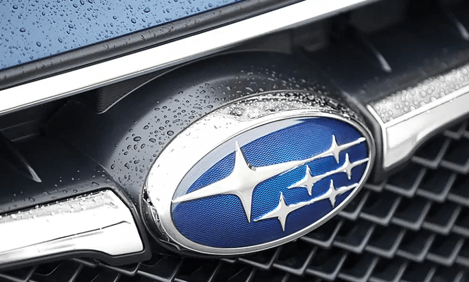
Subaru Logo: The Significance And Gradual Evolution

So, you can’t help but wonder how the Subaru logo turned out the way it is and that there must be a meaning for those six sparkling stars. Everything has an origin, and behind the Subaru logo also lies an intriguing tale that is in turn executed very professionally to represent their growth in the automobile business.
The Subaru brand
Currently, Subaru is among the biggest automobile manufacturers around the world and one of Japan’s best global brands. In particular, Subaru was the 21st largest automaker in the year 2017. As of 2021, it held the 13th position for Japan’s best global brands ranking. Many car researchers and critics hold Subaru’s products in high regard due to their durability, reliability, and practicality.
If you don’t believe me, then take a Subaru out for a ride, ask your acquaintances who own Subarus and make the judgment yourself. Not only are the figures really cementing their place as one of the most recognizable and reliable brands, but their logo history is also kind of interesting as well.
Subaru is the car manufacturing division of Japanese transportation conglomerate Subaru Corporation. The Subaru Corporation was once called Fuji Heavy Industries. This brand is notable for their use of a boxer engine (or a flat engine), which is generally described as a piston engine with two cylinders sharing a central crankshaft (look this up for clearance). This boxer engine is used in most of their vehicles above 1500cc, an all-rounder boasting impressive explosive power and durability while retaining smooth driving experience when needed.
Subaru has branches situated in many Western countries, mainly so that they can import their cars manufactured in Japan there for consumption. Like most Japanese automobile brands, Subaru boasts a loyal follower community that adores their signature engines and drivetrains (since we all love novelty).
What Subaru stands for
For some of us, the design of the logo might look unassuming, but you will be surprised to find out what it stands for. All in all, Subaru has stuck with the same idea behind its logo, with only some changes due to the company catching up with modernization in the automobile manufacturing world and to reflect their own achievements and revolutionary changes.
To understand the meaning of Subaru’s recurring design choice of six stars placed in different constellations, you need only look at the name of the brand itself. If you have ever heard of the Pleiades star cluster, Subaru is actually the Japanese equivalent of this term. Pleiades stands for “seven sisters”, but one is often referred to as invisible, hence the six stars in Subaru’s logo. In fact, that one star actually hid behind another, together they made a much brighter dot in the night sky, so the design choice was intentional.
Not only that, the parent company Fuji Heavy Industries at the time also consisted of six subsidiary companies. The first CEO of FHI, Kenji Kita was the one to come up with Subaru’s name when he decided that the corporation should be entering the car manufacturing business. Hats off to this guy for such a cool company name.
>> Check out: Mazda Logo: The Fascinating Journey Of Evolution
Subaru logos through the years
1953-1980
The six stars had been the Subaru logo’s theme from the start. Even the positions of the stars are quite similar if not exactly the same from this era until the 1980s. This recurring logo, in particular, lived the longest out of all Subaru logos. It was a simple design, with the seven stars aligned in the way the Pleiades appeared in the sky.
The sharp four-pointed stars were enclosed within a thin oval shape. The color palette is black throughout, and such a monochrome design is always the least interesting yet laid the foundation for Subaru’s rapid growth in the future.
1953-1958
The logo designed in 1953 was a little bit different in the sense that it is then a 3D version of the same logo. The color is now changed to a shiny silver palette and all the outlines on the oval and the four-pointed stars are now bolded and highlight the silver gradients.
Although the idea behind it was the same, the execution has greatly leveled up, giving the logo a much more refined look, overall, much better looking than the first.
1958-1959
After the silvery logo, Subaru decided to take it up a notch and change the logo to a golden color palette. In particular, the logo spotted a gold oval with six gold stars, with a thin line to connect them. As with its predecessor, it was very good looking on Subaru’s cars.
1959-1970
This is where the Subaru logo’s history became more colorful. They have actually added a background. It is a very wise decision indeed as nothing even comes close to the 1953-1958 Subaru logo, with the stars and oval and lines in silver color. Ease the intensity of the bolded outlines, put a popping color in the background and you get a captivating logo that represented Subaru’s passion for innovation and refinement.
1970-1980
The only change in this period was the background which was changed into black with small dots inside the oval and all that was inside the oval got surrounded by a U-shaped figure.
1980
The 1980 logo was very much similar to the 1953 logo, but without the lines connecting the stars. The outlines were once again bolded to highlight Subaru’s aptitude for producing quality, reliable and durable cars.
Interestingly, there is more than just a layer of meaning for the name Subaru. In Japanese, Subaru also means “unite”, which can be aptly referred to as the unity of all of the 6 companies that together form the parent corporation Fuji Heavy Industries. The biggest star represents the FHI, while the rest represents the subsidiary companies. After the 1950-1980 period, Subaru logo was changed to fit this alternate meaning.
>> Read more: 15 Surprising Facts About JDM Cars
1980-2003
The same oval with 6 stars was once again used, but now with the connecting lines abandoned altogether, and the position of the stars were different, with the biggest and brightest star now separated from its smaller subordinates, to represent FHI as the parent company.
The oval and stars were put on a deep blue background. The gradient silver color palette evolved into a sleeker and shinier version of itself, which is very elegant.
2003-2019
The logo was once again modernized in 1999. It took on a more cartoonish look, but everything was brighter and easier to see, not to mention the subtle merge between the stars to signify FHI’s relationship with the constitutional companies, Subaru included. The background is a shinier deep blue color.
2019-present
The only notable change was the decision to put a large SUBARU under the usual oval figure. The capital letters are in a traditional sans-serif typeface and are in all-black color. It is evident that Subaru’s logo is intended to be as simple as possible, while maintaining the message to its potential customers as a car brand that is simple in looks but practical, reliable on the road.


