What is The Meaning of The Toyota Logo?

The Toyota Motor Corporation was founded by Kiichiro Toyoda in 1937. A long time has passed, and as of today, Toyota has already become a household name around the world, and one of Japan’s best motor companies. As a matter of fact, Toyota has constantly been in the top ranks on all the charts conducted in Japan (even coming in first place in most of them).
If you look into the journey that Toyota took in order to get to where they are now. Their work ethics coupled with their will to change for the better, you won’t be surprised.
Toyota is one of the largest manufacturers in the automobile industry, with around 10 million cars produced every year. Now, it is the 9th largest company by revenue in the Fortune 500. Quite an achievement, don’t you think? When you think of a Toyota car, you immediately envision a reliable and powerful vehicle with road performance above anything you could expect for a car.
Of course, they have their own standards, but car designers at Toyota aren’t old-fashioned in any way. Contemporary technological advancements are also heavily featured in every new Toyota product. Toyota has been a leader in the development of hybrid electric vehicles, which is currently the trend around the world.
The root of Toyota’s success in bringing cars of exceptional quality to people of many backgrounds dates back to its infancy. Toyota was actually the name of a company founded by Kiichiro Toyoda’s father, Sakichi Toyoda back in 1926, Toyota Industries, and Toyota Motors were but a section of this company.
During World War II, Toyota was dedicating all its resources to providing the Japanese army with simple trucks, contributing greatly to Japanese forces. The allied forces found out about the company’s efforts to aid Japan, so they were planning to bomb their factories. Luckily enough, the war’s abrupt end-stopped them in their tracks.
After World War II, Japan’s alliance with the United States brought forth an unprecedented opportunity for Toyota Industries, especially the future Toyota Motor Corporation.
Kiichiro Toyoda would be sent by his father to learn from great US automakers and give birth to the well-revered “The Toyota Way”, which later completely transformed the company and fast-forwarded its rise to the top in Japan and later as a global brand.
Despite facing many challenges and standing on the brink of bankruptcy on multiple occasions, Toyota time and again pulled itself back into the game.
The logo is the face or visual identity of the company. Although most of the time they aren’t as important as the company’s products themselves, they can symbolize said company’s core values in its respective period.
We are certainly all familiar with the current one, but today we will be reviewing some of Toyota’s logos from the very beginning phases of the company. I must say there have been some radical changes in their appearances, and every single one of them marks a certain milestone for Toyota’s development.
>> Related post: Mazda Logo: The Fascinating Journey Of Evolution
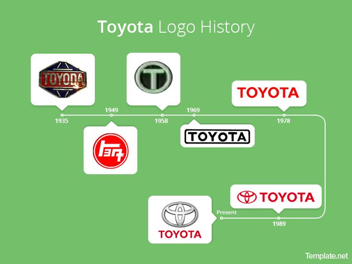
1935-1949
The first-ever Toyota logo was named “Toyoda” after the Toyota Industries founder Sakiichi Toyoda. The way I have seen it, there were as many as 2 versions of the “Toyota” logo. One of the versions had a completely red color palette. The bolded, all-caps “TOYODA” was surrounded by various border lines, consisting of two octagonal borders and several lines between them (or you could say the “TOYODA” was put inside a diamond). The other version was essentially the same, but with the TOYODA and border lines now in gray, and the inside and outside borders had red and blue backgrounds, respectively.
1949-1989
In 1949, Sakichi Toyoda held a logo design competition heeding the advice of an expert from General Motors. The new logo format was kind of flashy, to say the least. But Sakichi was not just picking the logo on a whim, he explicitly stated 3 requirements for the new logo:
- It has to be easy to understand
- It has shown that Toyota is one of Japan’s domestic companies
- The brand name will be written in Japanese letters instead of Latin characters.
What came out of the competition was exactly what you would expect: “TOYOTA” replaced “TOYODA”. Although “TOYOTA” wasn’t very different in terms of spelling and pronunciation (it is essentially the same to British people, for example), when written in Japanese it had fewer strokes (8 strokes to 10 strokes), easier to the eyes, and therefore fitter for marketing.
Also, 8 is a lucky number that symbolizes the aptitude for growth, whereas 10 means perfection and therefore means the company has no more room to grow, which obviously isn’t true. The “TOYOTA” was put inside a red and white themed circle. 1949 was the year Toyota came to be.
1958-1969
In 1958 the logo underwent a bold and surprising change of face. Not only is the all-caps “TOYOTA” in full latin again, but it is now in a Times-New-Roman-like plain black font and also the only thing left on the logo.
The flashiness has certainly disappeared without a trace, the red and white circles were abandoned. However, it highlights the company’s simplicity (in a good way) in its mindset: to make reliable, mainstream, exceptional vehicles for everyone.
1969-1978
Looking at it upfront, you may question Toyota’s decision to make such a subtle change. Obviously, there is a deeper meaning for this.
The “TOYOTA ” is now in Helvetica font, with well-defined, sturdy lines instead of Flagler alternating stroke weights of the Times New Roman. It signifies the company’s evolving mentality and its long-lasting development into the future.
1978-present
The logo is red again. Toyota decided to stick with this color and font for the “TOYOTA”.
1989-present
In 1989, we witnessed the birth of the most iconic emblem that you can find with regard to today’s Japanese cars. If you couldn’t make out what the logo consisted of or was inspired by. Let me elaborate: it is made from essentially three overlapping ovals.
As for the meaning of the emblem, there is more than one. However, the most interesting and most used explanation is that they form every single character of the word “TOYOTA”. Of course, in a stylized fashion. The logo is all red.
2005-present
The emblem was changed to sport a 3D silver color palette to create a metallic feel. It is positioned on top of the “TOYOTA”.
2019-present
The 2019’s logo was the same as during the 1990s. But now the emblem’s contours are white while the square background is red. The “TOYOTA” is also changed to black color.
>> Related post: What Is The Meaning Behind Nissan Logo?
2020-present
In 2020, Toyota’s logo was once again simplified. Now only the emblem remains while the text was discarded, the refined contours were colored in a black palette. Black is once again the main theme of the Toyota logo.
This logo might look plain on a white background. But it symbolizes Toyota’s single-mindedness in trying to create the most astonishing products to the best of their abilities. So as to satisfy the needs and expectations of their ardent followers.
As you can see, the Toyota logo has been through a lot of changes. And it is very likely that we will be witnessing more and more new logos from Toyota.
This is the same for every other automobile company. Times are changing and successful companies like Toyota must keep up with the waves of innovation to stay on top.


